

Fooling the Foolable
A paper-thin crust on a lake of dreck

Won’t lie to you. I’m not feeling it today. Nearly two years in, and I worry that my last good newsletter idea was three months ago and involved He-Man.
So I did what most bored, uninspired people seem to do. Outsourced it all to a robot.
“Write a snarky newsletter about why message trumps design and crowbar in at least one reference to Leeds United.”
What can I say. I have a go-to topic.
The results didn’t hugely impress me. Readable enough at a skim, but no new insight, no personality (duh, LLMs aggregate everyone else’s insights and smooth out the joins) and basically a waste of time.
Shared it with Hampson though. Because what’s the point of wasting your own time when you could waste someone else’s?
He said the same. Readable enough, but paper-thin. Didn’t understand why it rubbed me up the wrong way.
That’s because when it comes to Leeds United references, he’s foolable.
Here’s what the LLM churned out:
“It’s clear, direct, and connects with your audience like a Jack Harrison volley from the edge of the box (which, let’s be honest, rarely happens, but when it does, it’s magic).”
Jack Harrison hasn’t played for Leeds in 18 months. He’s busy being shit at Everton. He’s also never scored a volley from the edge of the box. His goal at Brentford away that kept us up was a half-volley at best.
That detail’s enough to mark this out as inauthentic to a football purist like me.
We then ran the prompt through a different word churner, to see what’d happen.
Speaking of Elland Road, there's a place where hope goes to die. It's as if the stadium itself is designed to amplify the sounds of collective groans and facepalms. But hey, at least the design is on point, right? Who cares if the message is "We're shit" as long as it's delivered in a nicely painted stadium?
Nicely painted? That bird shit is still there this season, pulling focus from the West Stand asbestos. You can’t fool me.
The design of their kits? Plain white, about as exciting as watching paint dry.
Excuse me? It’s a design classic so synonymous with sporting excellence that Real Madrid ripped it off. Well, invented it and Leeds copied it. Either way, who are you fooling?
Years into this “AI” experiment, and we’re still deep in the uncanny valley. Little tells that show this wasn’t actually written by someone who understands what they’re creating.
Which isn’t only an issue with automatically generating your content. It’s a problem you see when you have work written to impossible deadlines by flesh-and-blood human beings.
Without the time to dig into a topic, understand it, get on board with the audience and learn how they speak about it, Sarah Connor’s going to create copy just as uncanny and unconvincing as the T-800.
I guess like most of my newsletters, this is an anecdote that boils down to one key takeaway.
Regardless of who’s writing (or assembling words like a digital ransom note), you’ve just got to have empathy.
Otherwise, you’re committed to fooling the foolable.
Something mint - this, shamelessly copied from the Copyranter’s homework
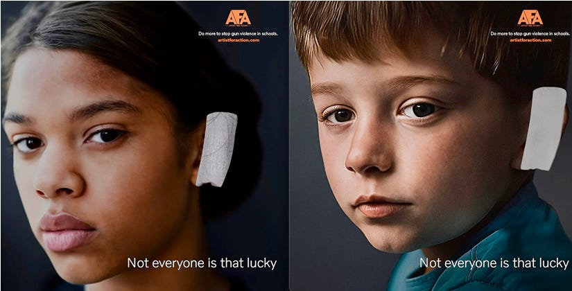
It’s Mark “Copyranter” Duffy’s second best ad of August. And it shows everything you need to know about empathy.
Dead simple. Young kids, wearing an ear bandage just like Donald Trump and lots of strange folk at his rallies. Killer strapline. Literally and metaphorically.
But break it down. How does this ad exist? How many levels of understanding do you need to make this?
You need to understand that school shootings are a huge problem
That’s a subset of another, huger problem - gun violence
That one of the biggest enablers of gun violence was a victim of gun violence himself
That the supporters of said enabler adopted a symbol of that victimhood as a rallying cry against people trying to end that violence
That there’s something karmically unfair about enablers getting away with a scratch when kids are dying
Five little bits of empathy and understanding that go into a very simple image and line. That takes time, practice, craft, and more than a little intangible human quality.
If you want to know what’s better than that ad, you’ll need to subscribe to Copyranter and check out the car insurance TV spot he likes so much.
The Message First bit - Hampson plays to the gallerists
Designers, eh? Lovely people. Bit into their crayons, but you can’t hold that against them.
Turns out, our Message First approach suits them down to the ground.
Makes their lives easier, makes their clients happier, makes their wallets fatter.
Sounds pretty good, in fairness.
Ben Hampson explains all over on the HNW blog.
